.png)

Simplifying course fee discovery at Macquarie University
Scope of work
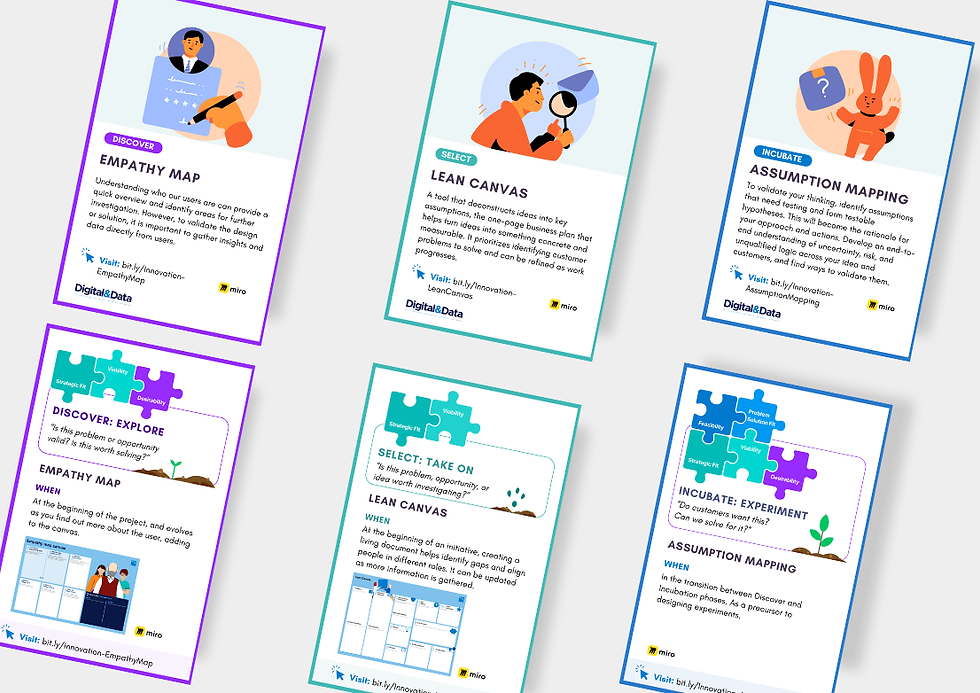
Discovery and research
Stakeholder management
User experience (UX)
User interface (UI)
User Testing
Company
Macquarie University
Year
2022
My role
Lead designer
Understanding course fees were one of the most frequent and frustrating enquiry topics amongst students
Students frequently contacted the call centre asking a simple question.
"How much will my course actually cost?"
They weren't struggling to find information. They were struggling to make sense of it.
Fee details were spread across multiple nested web pages and PDFs that was layered with government terminology, pricing models, and eligibility rules. For many students, understanding the true cost of study not only required a significant effort, it was a big information and document hunt.
During peak enrolment periods, this complexity translated into high call volumes and increased operational strain.
The challenge
University fees aren’t one-size-fits-all in Australia. Depending on a student’s status, they may:
-
Receive a government subsidy
-
Pay full tuition fees
-
Be charged per subject
-
Or be charged a flat program fee
Behind the scenes, this complexity was managed across manual excel spreadsheets owned by university fee administrators. Fee data wasn’t integrated into course structure systems, making updates manual and visibility limited.
And so we set out to answer:
How might we simplify fee discovery so students can clearly understand the cost of their study — without stress, confusion, or manual searching?


Improving the Macquarie student experience
As Lead Designer, I worked end-to-end across the initiative. I was responsible for:
-
Framed the opportunity and aligned cross-functional stakeholders
-
Led research and synthesised student fee behaviours and cost sensitivities
-
Defined the solution strategy and experience principles
-
Facilitated collaborative exploration and iterative prototyping
-
Scoped and delivered a constrained MVP with engineering

Phase 1: Understanding the complexity
Before designing anything, we mapped the ecosystem and ran discovery with cross-functional stakeholders and students.
University fees aren't simple and they vary across multiple variables
Stakeholder workshops revealed that fees depend on:
-
Student type: Domestic (government subsidised) vs International (full fee paying)
-
Pricing model: Unit-based pricing (each subject has different cost) vs flat course fees
Research showed that students' cost sensitivity exists on a spectrum
-
Low sensitivity: Students who primarily just want the total course cost
-
Moderate cost sensitivity: Finance-sponsored students who need clarity to communicate costs to parents or sponsors.
-
High cost sensitivity: Self-financing students who need detailed per-unit breakdowns to manage cash flow and budgeting.

Phase 2: Defining experience principles
From research and discovery, we established three guiding pinrciples to design our future state solution and anchor the team's decision moving forward:
Make it easy and simple to understand
Avoid fee jargon. Use plain language. Reduce cognitive load.
Transparency is key
Clarify what is included, what is estimated, and what may vary.
Educate without stress
Present a logical, guided pathway so students can self-identify their fee category.
Phase 3: Design and test
Instead of redesigning pages in isolation, we asked:
What if course fee discovery was a guided journey, not a document hunt?
Because fees vary by student type, eligibility, and pricing model, showing everything at once overwhelmed students with too much information. So we explored ways to:
-
Let students self-identify their type. Are you domestic or international?
-
Clarify eligibility early for subsidies
-
Present fees in a consistent, scannable format
-
Reduce reliance on PDFs entirely
Through design jams and rapid prototyping, we tested guided flows, total course views, and unit-by-unit breakdowns. The solution was not to design something that's only visual, we had to reframe the experience.
User testing with current and prospective students showed one clear pattern.
When fees were surfaced contextually and not buried in downloads and PDFs, students felt more confident, guided and less cognitively overloaded.

Phase 3: Iterative test, learn, refine
We ran structured test-and-learn cycles and co-design sessions wiwith messaging consultants and engineers to strengthen the AI’s reliability in real world conditions.
This included facilitating keyword-mapping and semantic workshops with consultants to improve accuracy and relevance. We captured synonymous language used in real customer conversations and mapped policy sections commonly referenced together, ensuring the AI could understand intent in context, not just keywords in isolation.
In parallel, we partnered closely with engineering to refine prompt strategy, establish guardrails for scope control, and structure content semantically to improve contextual accuracy.
Because OpenAI is a pre-trained model with no inherent Bupa context, this phase required deliberate knowledge and systems design. It was the critical step that transformed a promising proof of concept into a reliable MVP consultants could trust and use.


Phase 4: Prioritising our MVP
The long-term vision was a full system integration to connect our backend fee data directly with course structures to create a single, dynamic source of truth.
But we were working within real constraints before launch:
-
Separate backend CSV systems were owned by fee teams
-
Limited integration capability
-
A fixed enrolment timeline fast approaching
So we scoped a focused MVP where we prioritised progress over perfection. We designed a solution that could meaningfully reduce confusion now, while intentionally pipelining future iterations.
Our first release focused on highest-need student cohorts which were:
-
Existing students planning their next semester and needing accurate unit cost breakdowns
-
Full-fee paying students seeking clear, upfront visibility of total course costs
From there, we mapped a staged roadmap to progressively enhance functionality when backend systems were evolved.
The solution: Course fee calculator

Self-select guided tool
Students identify their student type (domestic vs. international, undergraduate vs. postgraduate) before seeing results. This filters down fee variables, reducing ambiguity and ensuring the fee is personalised to you.

Clear fee results
We ensured there is a structured cost breakdown showing estimated annual fees, per-credit or per-unit cost, total course estimates and key disclaimers with no jargon.

Integrating course visibility in result
Fee results were directly linked to the relevant course pages, creating continuity between cost visibility and course exploration. Students could move from fee clarity to course detail without restarting their search.

What launched
A self-select guided fee tool with searchable course and unit lookup, replacing 10+ static PDFs with one structured experience.
What changed
Improved fee transparency during enrolment, reduced manual navigation, and lowered cognitive load for students budgeting their study.
What the MVP enabled
Established a scalable and buildable foundation for future design and scoping to more student cohorts.
What's next
A phased roadmap to expand functionality for prospective students and evolve toward full system integration.
Impact from discovery to launch
What I learned from this project
You can't solve everything in one go
Alignment first to prevent friction later
Bringing marketing, enrolment, finance, and tech into the room early shaped better decisions downstream. I learned that stakeholder clarity is as important as user clarity. Both reduce rework.
System constraints sharpen decision making
Working with separate data systems and tight enrolment timelines forced disciplined prioritisation. Rather than waiting for what's ideal, I learned to design within them. Strong alignment with engineering and early scoping decisions made it possible to launch something meaningful.
Complexity must be translated, not transferred
I learned that when systems are inherently complex, we shouldn’t expose that burden to users. My role was to interpret the rules, models, and edge cases. As an experience designer, my impact is clarity and not more confusion.
Other work

Designing an AI agent for Bupa's consultants
Transforming consultant workflows with $1.02M impact

Transforming digital referral journeys at Bupa Dental
Optimising journeys to deliver $118k in new patient revenue
Design leadership in practice
Creating spaces, tools, and rituals that help design thinking spread beyond the design team.

.png)
Let's make something meaningful together
Made in sunny Radelaide!
© 2026 by Denise Tan